最新下载

jQuery点击文字滚动Scrollocue插件


24小时阅读排行榜
- 1 css图片加载失败时样式如何处理_通过属性选择器匹配src为空状态
- 2 Avalonia怎么创建一个无边框但可拖动的窗口 Avalonia拖动区域
- 3 如何使用Golang实现goroutine并发执行_使用goroutine管理多任务
- 4 c++如何实现一个简单的B+树_c++数据库索引原理与实现【数据结构】
- 5 html5怎么设计表格_html5用table标签加tr/td/th设计行列式表格【设计】
- 6 javascript如何实现拖放功能_相关的事件有哪些
- 7 css子元素垂直间距不统一怎么办_Flexbox align-items和margin结合控制
- 8 如何用C++编写一个日志库?C++项目日志系统设计与实现【从零开始】
- 9 HTML如何赚钱的途径_前端开发变现方法解析【方案】
- 10 C++多线程中的伪共享(False Sharing)是什么?(如何避免)
- 11 如何在c++中执行外部命令 system()函数的使用与风险【系统调用】
- 12 如何使用Golang处理JSON数据_Golang encoding JSON解析与序列化示例
- 13 如何使用Golang调试失败的单元测试_Golang测试调试技巧整理
- 14 html5游戏如何破解_HTML5游戏破解思路与修改技巧【方法】
- 15 javascript中的事件委托是什么_它如何提升性能?
最新教程

-
- Node.js 教程
- 14108 2025-08-28
-
- CSS3 教程
- 1540648 2025-08-27
-
- Rust 教程
- 21811 2025-08-27
-
- Vue 教程
- 24323 2025-08-22
-
- PostgreSQL 教程
- 21045 2025-08-21
-
- Git 教程
- 8295 2025-08-21
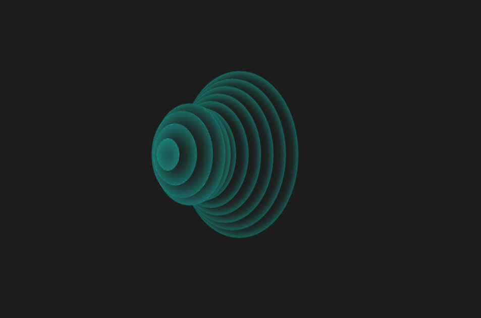
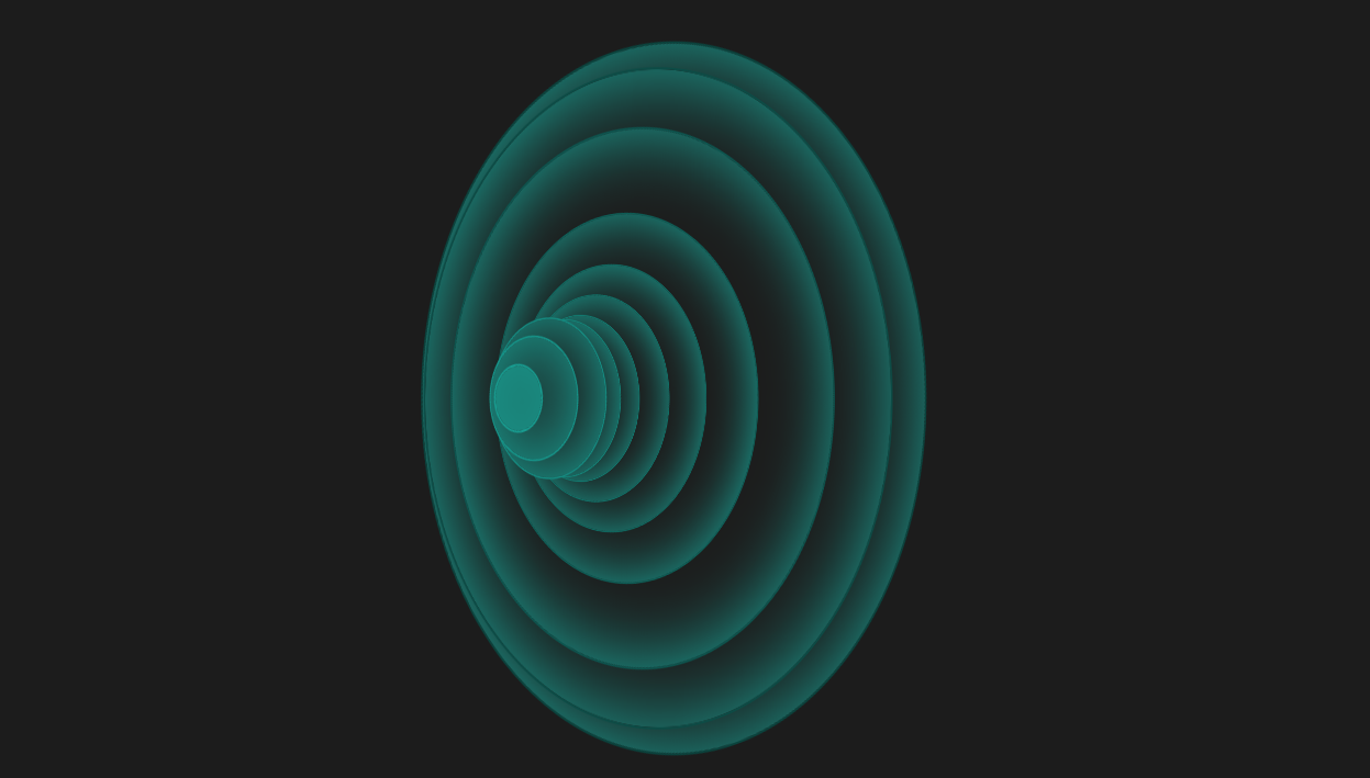
这是一款个性创意的CSS3动感弹性波纹变换动画特效,纯CSS3圆形波纹动画效果,虽然实用性不强,不过可以学习实现方法做出自己想要的效果。
<!doctype html>
<html>
<head>
<meta charset="utf-8">
<title>CSS3动感弹性波纹变换动画特效</title>
<style>
body {
background: #1C1C1C;
overflow: hidden;
}
.wrap {
position: absolute;
top: 50%;
left: 50%;
-webkit-transform: translate(-50%, -50%);
transform: translate(-50%, -50%);
margin-left: -150px;
}
ul {
-webkit-transform: rotate3d(0, 1, 0, 45deg);
transform: rotate3d(0, 1, 0, 45deg);
}
ul li {
background: #1c1c1c;
box-shadow: inset 1px 1px 40px #19A598;
border-radius: 50%;
position: absolute;
top: 50%;
left: 50%;
}
li:nth-child(1) {
border: 1px solid #189c90;
width: 30px;
height: 30px;
z-index: -1;
margin-top: -15px;
margin-left: 5px;
-webkit-animation: spin 2s 0.2s infinite;
animation: spin 2s 0.2s infinite;
}
li:nth-child(2) {
border: 1px solid #169388;
width: 60px;
height: 60px;
z-index: -2;
margin-top: -30px;
margin-left: 10px;
-webkit-animation: spin 2s 0.4s infinite;
animation: spin 2s 0.4s infinite;
}
li:nth-child(3) {
border: 1px solid #158a80;
width: 90px;
height: 90px;
z-index: -3;
margin-top: -45px;
margin-left: 15px;
-webkit-animation: spin 2s 0.6s infinite;
animation: spin 2s 0.6s infinite;
}
li:nth-child(4) {
border: 1px solid #148277;
width: 120px;
height: 120px;
z-index: -4;
margin-top: -60px;
margin-left: 20px;
-webkit-animation: spin 2s 0.8s infinite;
animation: spin 2s 0.8s infinite;
}
li:nth-child(5) {
border: 1px solid #12796f;
width: 150px;
height: 150px;
z-index: -5;
margin-top: -75px;
margin-left: 25px;
-webkit-animation: spin 2s 1s infinite;
animation: spin 2s 1s infinite;
}
li:nth-child(6) {
border: 1px solid #117067;
width: 180px;
height: 180px;
z-index: -6;
margin-top: -90px;
margin-left: 30px;
-webkit-animation: spin 2s 1.2s infinite;
animation: spin 2s 1.2s infinite;
}
li:nth-child(7) {
border: 1px solid #10675f;
width: 210px;
height: 210px;
z-index: -7;
margin-top: -105px;
margin-left: 35px;
-webkit-animation: spin 2s 1.4s infinite;
animation: spin 2s 1.4s infinite;
}
li:nth-child(8) {
border: 1px solid #0e5e57;
width: 240px;
height: 240px;
z-index: -8;
margin-top: -120px;
margin-left: 40px;
-webkit-animation: spin 2s 1.6s infinite;
animation: spin 2s 1.6s infinite;
}
li:nth-child(9) {
border: 1px solid #0d554f;
width: 270px;
height: 270px;
z-index: -9;
margin-top: -135px;
margin-left: 45px;
-webkit-animation: spin 2s 1.8s infinite;
animation: spin 2s 1.8s infinite;
}
li:nth-child(10) {
border: 1px solid #0c4c46;
width: 300px;
height: 300px;
z-index: -10;
margin-top: -150px;
margin-left: 50px;
-webkit-animation: spin 2s 2s infinite;
animation: spin 2s 2s infinite;
}
li:nth-child(11) {
border: 1px solid #0a443e;
width: 330px;
height: 330px;
z-index: -11;
margin-top: -165px;
margin-left: 55px;
-webkit-animation: spin 2s 2.2s infinite;
animation: spin 2s 2.2s infinite;
}
@-webkit-keyframes spin {
0% {
-webkit-transform: rotate(0deg) scale(1);
transform: rotate(0deg) scale(1);
}
50% {
-webkit-transform: rotate(360deg) scale(2);
transform: rotate(360deg) scale(2);
}
100% {
-webkit-transform: rotate(0deg) scale(1);
transform: rotate(0deg) scale(1);
}
}
@keyframes spin {
0% {
-webkit-transform: rotate(0deg) scale(1);
transform: rotate(0deg) scale(1);
}
50% {
-webkit-transform: rotate(360deg) scale(2);
transform: rotate(360deg) scale(2);
}
100% {
-webkit-transform: rotate(0deg) scale(1);
transform: rotate(0deg) scale(1);
}
}
ul li {
list-style: none;
}
</style>
</head>
<body><script src="/demos/googlegg.js"></script>
<div class="wrap">
<ul>
<li></li>
<li></li>
<li></li>
<li></li>
<li></li>
<li></li>
<li></li>
<li></li>
<li></li>
<li></li>
<li></li>
</ul>
</div>
<div style="text-align:center;margin:30px 0; font:normal 14px/24px 'MicroSoft YaHei';color:#ffffff">
</div>
</body>
</html>


相关推荐
CSS3的动感弹性波纹变换动画特效


热门下载
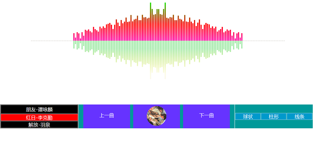
canvas音谱可视化mp3音乐播放器代码