
首先看代码和效果
<style>
        .main {
            outline: 1px solid;
            display: flex;
            justify-content: space-between;
            flex-wrap: wrap;
        }
        .main>p {
            width: 100px;
            height: 100px;
            margin-bottom: 10px;
            background-color: lightgreen;
        }

    </style>
    <body>
        <p class="main">
            <p>1</p>
            <p>2</p>
            <p>3</p><p><span>立即学习</span>“<a href="https://pan.quark.cn/s/cb6835dc7db1" style="text-decoration: underline !important; color: blue; font-weight: bolder;" rel="nofollow" target="_blank">前端免费学习笔记(深入)</a>”;</p>
            <p>4</p>
            <p>5</p>
            <p>6</p>
            <p>7</p>
            <p>8</p>
                    <div class="aritcle_card">
                        <a class="aritcle_card_img" href="/ai/1584">
                            <img src="https://img.php.cn/upload/ai_manual/000/000/000/175680266797527.png" alt="钉钉 AI 助理">
                        </a>
                        <div class="aritcle_card_info">
                            <a href="/ai/1584">钉钉 AI 助理</a>
                            <p>钉钉AI助理汇集了钉钉AI产品能力,帮助企业迈入智能新时代。</p>
                            <div class="">
                                <img src="/static/images/card_xiazai.png" alt="钉钉 AI 助理">
                                <span>204</span>
                            </div>
                        </div>
                        <a href="/ai/1584" class="aritcle_card_btn">
                            <span>查看详情</span>
                            <img src="/static/images/cardxiayige-3.png" alt="钉钉 AI 助理">
                        </a>
                    </div>

        </p>
    </body>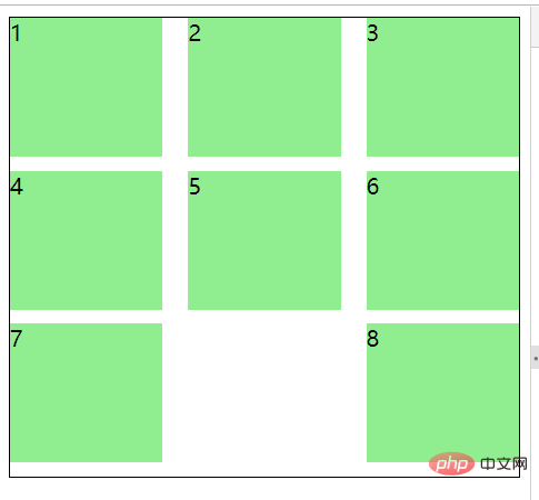
可以看到最后一个p并没有在中间,而是在最后了
因为我们设置了justify-content为space-between,意思就是两边贴边
这时候我们可以给最外层p设置个伪元素,宽度和里面的p宽度一样就好了
只需要两行css就可以
.main:after {
    content: "";
    width: 100px;
}这时候看效果
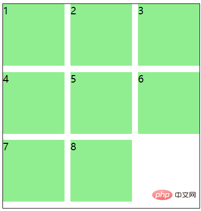
其实原理就是最后一个伪元素把他挤过来了
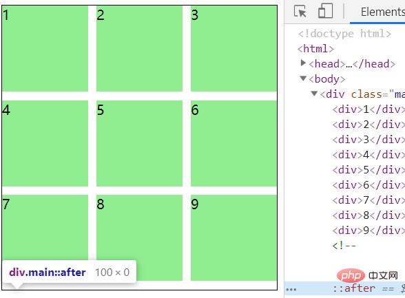
就算有9个也没影响,因为他的高度是0,看下图↓
推荐教程:《CSS教程》
以上就是CSS Flex 布局 space-between 最后一行左对齐的详细内容,更多请关注php中文网其它相关文章!

每个人都需要一台速度更快、更稳定的 PC。随着时间的推移,垃圾文件、旧注册表数据和不必要的后台进程会占用资源并降低性能。幸运的是,许多工具可以让 Windows 保持平稳运行。

 广告
广告
 收藏
收藏
 收藏
收藏
 收藏
收藏
Copyright 2014-2025 https://www.php.cn/ All Rights Reserved | php.cn | 湘ICP备2023035733号


 251
251


