


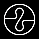
0.静态效果图


1.画弧度的代码
width: 3em;
height: 3em;
border: 7px transparent solid;
border-left: 7px #4DB6AC solid;
border-radius: 50%;
* 这里还有另一个方式
border-left:7px #4DB6AC solid;
border-radius: 50%;
border-top:7px transparent solid;
border-bottom:7px transparent solid;
后者做成旋转动画效果不如前者,肉眼能感到差异,在chrome49.
2.画扇形的代码
border: 7px transparent solid;
border-left: 7px #4DB6AC solid;
border-radius: 50%;
* 画扇形不可以定义宽度和长度,其余与画圆弧相同
3.less 封装画圆弧和扇形的代码


.arc(@direction,@style){
@color:~`"@{style}".split(/,\s+/)[1]`;
@width:~`"@{style}".split(/,\s+/)[0].replace("[","")`;
@shape:~`"@{style}".split(/,\s+/)[2].replace("]","")`;
border: @width transparent @shape;
@length:length(@direction);
.setStyle(@length,@style,@direction);
border-radius: 50%;

.setStyle(@length,@style,@direction) when (@length>0){
@index:@length - 1;
@pos:extract(@direction,@length);
border-@{pos}:@style ;
.setStyle(@index,@style,@direction);

}
}
//使用方式:
@driection 可以是top、left、right、bottom中的一个或多个
@style 需要严格按照 7px solid red 这样的顺序
.arc(left,7px solid red);
.arc(left top,7px solid red);4.加载动画的完整代码


Document
5.声明
案例代码是我从网上看到的,我自己模仿了一下但无论效果和方法上都不如前者。
欣慰的是能够知道原理,只是细节之处还需练习。


